Chapter 4: Static Site Development
Revised June 2003

|
Chapter 4: Static Site DevelopmentRevised June 2003 |
 The preceding chapter sets forth The Right Way to do a Web site
using a massive database management system and tens of thousands of
lines of computer software. This approach is not the best fit for every
publisher's budget and system administration skills. Certainly it is
much simpler to operate a Web site that is merely a set of files in a
Unix or Windows file system, i.e., a static site. Do people need
a structured methodology for developing a static Web site? You wouldn't
think so. After all, a six-year-old with Microsoft Front Page can build
a working Web site.
Why don't these what-you-see-is-what-you-get (WYSIWYG) HTML editors enable everyone to become a competent Web publisher? They solve the wrong problem. In the early-ish days of the Web, say 1994, it was observed that college undergraduates who were Unix users could build themselves a Web page in about 30 minutes, even if they were English majors who had never taken a programming class. Users of Macintosh and Windows PCs were unable to produce Web pages at all. Software developers set out to solve what they thought was the desktop user's problem: HTML "programming" is too hard to learn.
It turns out that HTML "programming" consists of sticking "<I>" and "</I>" around a word that you want to appear in italics. Secretaries worldwide were successfully using word processors like this all through the 1970s. Had the average person's abilities declined so much in the succeeding 20 years that he couldn't learn that "the I tag is for italics; the B tag is for bold"?
Alan Cooper's interesting book on user-interface design, About Face (1995; IDG), makes the claim that users don't understand the difference between RAM and disk and further, that they don't understand the file system or directory hierarchies. Somehow people struggle along and get a letter printed but they are confused when they close a document and their word processor asks them if they'd like to save their changes. Save them where? Why weren't they saved before? Why is there a "file" menu on a typical program at all? Shouldn't a user just be working on a document and be offered the chance to revert to older versions?
 Building a Web site exposes and exacerbates all of the problems that
users have with their computer systems. No longer are they just trying
to print out a letter. They have to organize and link together a set of
documents. So if you give someone a WYSIWYG editor for HTML, he or she
will usually just get stuck 30 minutes deeper into the task of building
a site.
Furthermore, there is the problem of sample bias. Suppose that you go to the airport to try to estimate the percentage of vacant seats on that day's flights. You decide to stand in the arrivals area and ask folks how many vacant seats there were in their row. Sample bias skews your statistics because planes that were full contain more passengers than planes that were relatively empty. So you're likely to encounter a lot of people who will tell you that their rows were full and unlikely to find people who were on a nearly empty plane. You'll conclude that planes are 80 percent full when in fact they are closer to 60 percent full, for example.
If you're working with someone who has never published anything on the Web, be conscious of sample bias. In 1992 a user of a NeXT computer could browse an HTML document, edit it without seeing the HTML tags, and press a button to publish it back to the server. By early 1995, someone with a Mac or a PC could do this in NaviPress. By the late 1990s anyone with standard Microsoft Office could produce HTML. If a person had something to say and was facile with organizing documents in a computer file system, why in 2003 would they not already have a Web site? The sample bias inherent in working with people on their first Web site in 2003 is that you're likely to encounter someone who has nothing to say or has never understood computer tools. Either way, you are in deep trouble.
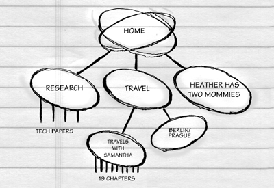
The static site development plan here is intended first to expose the need for structured thinking and to bring everyone on a project into sync over the fundamentals. Here's a sketch of the plan:

 The site map also gives you a chance to make the one-time versus anchor
service site design choice. Most graphic designers are inclined toward
building one-time Web sites. These have a bunch of lead-in pages
("entry tunnel") with introductory text and fancy graphics. This is the
equivalent of the 10-year-old's "Welcome to my home page on the Web".
The implicit assumption is that you've come here for the first time and
that you will never return. A lot of programmers, on the other hand,
are naturally inclined toward building Internet anchor sites. Look at
http://www.yahoo.com. The very first
page is lean and is essentially a menu of over 100 functional links.
There is no entry tunnel. There are no custom link colors. There are
no frames. The Yahoo folks assume that you've been there before, that
you know what Yahoo is, that you want to get a task accomplished, and
that you don't want to waste time figuring out how to get to the
functions. There is a "company info" link at the very bottom of the
page that will give you some background about Yahoo if you're confused.
If you have a huge advertising budget and a one-time event perhaps the one-time Web site structure makes sense. But otherwise it is almost always a mistake. In fact, users have caught on and develop an itchy "Back" button as soon as they suspect that they've landed on a one-time site. Life is too short to surf someone's advertisement. To attract users, a site's structure should send the message that the publisher expects visitors to return frequently to accomplish a task. Furthermore for most sites quite a few users will arrive via public search engines such as Google. These applications will not respect a Web designer's feelings and deposit all new users neatly at the beginning of the entry tunnel. Therefore you always have to ask whether the navigation strategy is sound. If a user got dumped by a search engine into a randomly chosen page on the map, would he be able to find his way back to the table of contents?
 Almost as troubling as the entry tunnel is the appearance of an owner's
manual/user's guide on the site map, such as "This site best viewed with
Internet Explorer Version X.Y or higher" or "Click here to find out how
to use this site." People spend $20,000 on new cars and don't read the
owner's manual. Why would a new Web publisher with a tiny site imagine
that a user is going to read the site's user's manual and then go out
and spend a few hours tuning up his software installations?
Let's get concrete. If we were building www.photo.net from scratch, what would the site map look like?
Overall principles: Site Map for photo.net
Directories:
- This is an anchor site, not a one-time site. The cover page will therefore have links to as many sections and services as possible.
- photo.net will not be temporal. There will be no notion of a "January issue"
File naming/organization conventions:
- /doc/ for documentation on the server itself, e.g., this directory spec
- /pcdNNNN/ for JPEG and FlashPix versions of images from the Kodak PhotoCD numbered NNNN (there will be several hundred of these directories as the site grows). All the .html files will reference images in these directories so that an image may be used in multiple sections.
- /tutorial/ for a textbook for learning photographers, with its own index page and links from each chapter back to the index.
- /travel/ for travel guides to various photographic destinations. Multi-document guides with custom illustrations, e.g., maps, will have their own subdirectories.
- /technique/ for specialized how-to documents, e.g., "taking photographs of star trails" or "macro photography". Any article that needs helper drawings will be in a subdirectory.
- /nikon/, /canon/, etc. for reviews of products from those various manufacturers
- /equipment/ for reviews of miscellaneous photo items that aren't manufacturer/system-centric, e.g., camera bags or tripods.
- /digital/ for articles about digital imaging, digital printers, scanners, etc.
- /workshops/ for reviews of photographic workshops
- /studio/ for studio photography, esp. controlled lighting
- /about/ for general credits (a masthead), explanations of how the site works, editorial/submission policy.
- /optics/ for tutorials on lens design
- /career/ for articles on photography as a career or business
- /legal/ for information about copyright and whether releases must be obtained from models or property owners
- /contributors/**username**/ will be a private FTP-writable directory for people who aren't part of the core photo.net team. The file index.html in this directory will contain some biographical information and a link to the person's main site.
- /new.html for a human-generated reverse chronological description of new content
Collaboration:
- figures go at same level as articles, e.g., foo-f01.gif is figure 1 for foo.html
- audio clips are kept in RealAudio format, in the same directory as the .html file that references them. If the audio clips are associated with a particular image on a PhotoCD, then they go in the pcdNNNN directory.
- all links are to abstract URLs, e.g., "/nikon/f5" rather than "/nikon/f5.html"
- Q&A forum
- comment link from the bottom of every article
- related links at the bottom of every article
- mailing list
 Once everyone is happy with the site map, the nodes should be given
filenames, e.g., "foobar.html". Then people must create these files and
stuff them with the content that they are ultimately to hold, not
worrying whether or not the content is in HTML format.
You can see whether everyone is up to speed merely by looking in the file system and seeing how many .html files have been written. If you're not a programmer, this is a good time to bring one in. If there are a few dozen pages that have nearly identical structure then it might be more cost-effective and reliable to have the content authors organize things into a flat file or relational database management system (RDBMS) and have the programmer either (1) write a custom Perl script to grind out all the .html files in advance, or (2) write a CGI or API script to generate the .html files on-the-fly.
Do you want readers to be able to discuss content? In one forum for the whole site or in sub-forums? Do you want to configure a comment server to collect page-specific comments? Are you going to ask readers to join a mailing list? If it turns out that you want a lot of collaboration maybe it is time to reconsider your reconsideration and go back to the whole hog RDBMS-backed site.
A graphic designer who is a careful and creative thinker about information presentation may be able to help give a site a clean look. The ultimate goal is to make sure the graphics version of the site, which will inevitably be slower to load than the text-only version, offers the user something extra. Graphics should be used to help users absorb, interpret, and understand data. If it is the same information with additional decoration, then users aren't getting much return on their increased investment of time. (See Edward Tufte's second and third books, Envisioning Information (1990), and Visual Explanations : Images and Quantities, Evidence and Narrative (1997), for some examples of how graphics may be used effectively.)
How to work with a designer? It is best first to make some decisions about what kind of user queries you can afford to answer. If you can't afford to pay people to respond to email wondering about browser incompatibilities and crashes then you probably can't afford to publish JavaScript or Java, even if the initial programming were free. Here's an example of a set of requirements someone might give to a designer:
Please don't construe the above as saying that designers shouldn't be given any scope. On the contrary, a graphic designer worthy of the name should be given maximum scope to develop user interface hints. For example, suppose you want older photos on your site to be distinguished from newer ones. You could ask the designer "come up with a way to stick a gold-leaf frame-type graphic around all the old photos." But probably it would be better to ask the designer to "come up with a graphical and/or text-y way to remind readers that they are looking at an old photo rather than a new one."
 A lot of big companies, at least for awhile, will spend millions of
dollars every year paying graphic designers to perform essentially
clerical functions, such as pasting new text into HTML templates.
Oftentimes both publisher and typists get upset on a site like this.
The publisher is frustrated because he has to holler into a telephone to
get a page looking the way he wants. The graphic designer is frustrated
because he is being used as a typist. If you don't have the budget
and/or patience to maintain a Web service this way, then you need some
plan for direct maintenance of the site by the publisher.
With a database-backed site this is straightforward. There are administrative Web pages in which authors enter or update text fragments using a standard Web browser. Computer programs weave these fragments together at request-time into complete HTML pages.
With a static site, you have to give the author some kind of desktop tool, e.g., Microsoft Front Page, or insist that each author spend a few hours learning enough HTML to edit the pages directly.
Even at this late date (June 2003), most desktop tools are so badly engineered and they put it so much crud (e.g., " " all over the place) that they are more trouble than they are worth. The extra crud makes it very hard for a Web expert ever to edit the pages manually. It also makes it tough to extract the content from the static files into a relational database. You can then add a little item to your page that says "this site engineered with Notepad".
 Version or source control is necessary to prevent lost updates. Here's
how a lost update can happen:
Programmers and technical writers at large companies are familiar with the problem of lost updates when multiple people are editing the same document. But Web publishing is the first time that the average person has to confront the problems of version/source control. You have to educate contributors maintaining a site via HTTP PUT or FTP that, if they aren't careful to grab the page just before editing and then save it right back, there is a serious risk that they will be overwriting someone else's edits.
If you're using a full-out RDBMS-backed system to run your Web site, it is relatively easy to add in a version control to check in/check out documents. It is also easy to keep historical versions around. But if you're keeping everything in a file system and expecting novice users to maintain the content via FTP, version control becomes tough. You have to encourage people to use email and telephone calls to check out documents or directories of documents.
See http://philip.greenspun.com/wtr/cvs for an approach to using version control tools on a site that comprises programs and static content stored in the file system plus some user-generated content in a relational database.
 Academic computer science and the software industry have been remarkably
unsuccessful at producing reliable or functional systems for users.
Though programmers may have failed, their PR counterparts succeeded
brilliantly. Casual computer users believe that computers are
intelligent. It would never occur to them that a computer can't handle
a special case or that the batch image conversion scripts in
the images
chapter need exactly one line per image and that an extra carriage
return or left-out vertical bar will abort the process.
If you are the most technical person on the project, at some point it may be worthwhile to stand up in front of the whole team and try to educate folks into realizing how stupid computers are and therefore that structured thinking upfront can pay huge dividends in the long run . For example, some friends once tried to build a catalog site for a clothing manufacturer. The garment maker's staff was very proud of their all-electronic fabric design and catalog publishing system, which they'd been using for a few years. There were photos or sketches of all the styles available in digital form. The manager of the desktop publishing shop thought it would be easy to make a Web site out of these. However, though they had numerical style or product IDs for their products, the graphics files weren't named "97-04561.tif". The files had names like "new spring jacket.tif" and were of all different sizes. It would have been impossible to write a computer program to fetch the right image file when a user was looking at a page for a particular product ID. Each file would have to be opened by a human, identified, and then renamed, a process that would take hundreds of hours.
 If the project is a failure and you haven't been able to educate
contributors into doing things sufficiently formally, you need to impose
structure on them. Budget $20,000 to $50,000 to rebuild the site as a
database-backed system to which people can contribute content only via
Web forms. The site's structure will then be a little rigid but at
least you won't have broken links, illegal HTML, etc.
"I've spent a good portion of the last 36 hours navigating through your web pages..."Are these in fact positive comments? Suppose these users all came to your site looking for your mailing address? Should you feel proud that it took them an average of 14 hours to find it? Perhaps it is time for a usability study.
"I have just spent two and a half hours with you..."
"Oh my god, I just spent three hours reading your site..."
For a proper usability study, you go to a special facility equipped with living room, classroom, and office sets. You sit the subjects at a computer on those sets and start them out on your Web site with a few tasks to accomplish or questions to answer. The proud parents of the Web site stand behind one-way glass and observe the floundering subject, who is encouraged to talk as he or she ponders the potential fruitfulness of the various links on a page.
The easiest kind of site to build and test is an ecommerce site. Everyone can agree on the goal: Make it fast and easy for the user to buy something. So a usability test might be to send a user to www.amazon.com and ask them to