by Philip Greenspun; created June 1999 and revised January 2007
Site Home : Photography : Architecture (Exterior)
This is an example-based tutorial on photographing buildings.
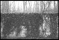
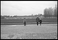
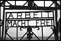
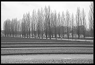
Architectural photography at its best will convey the experience of being in and around a built environment. In the case of the Dachau Concentration Camp, this won't result in comforting attractive images.
Below is a parking garage in Kyoto. The colors and industrial appearance of the structure are remarkable in the middle of a city known for its ancient temples and gardens. The purpose of the image is to capture the feeling of walking by the structure, not to delight or decorate.
A supermarket exterior is a subject that will probably never make a wall-worthy image by itself. However, the image below (from the Hawaii flowers collection) captures the spirit of being in the parking lot at night:
In general, the older the structure, the more environmental context is required.
Using your hands or your mind, crop the preceding images to include just the structures and see if they would still work. Also, compare them to a few modern buildings where hardly any context is required:
(The Big Boy pictures are also a good example of coming back repeatedly to a building in order to capture it in different lights and weather.)
Farms are a good example of where the structures don't make any sense removed from their context:
If you're not capturing an entire village or farm, it still makes sense to think about the space around your subject. Even a little bit of context helps anchor the image. For example, the image at right, from the sunset district of San Francisco, presents a straightforward view of a house. We could use it as a real estate advertisement. The fragment of the house to the left, however, isn't wasted space. It tells us how tightly packed the neighborhood is.
In the image below, the sidewalk, the fragment of street, the pedestrian, and the little open market to the left of the shop help establish the Guatemalan context:
Back up from an work of architecture and use a telephoto lens to compress the perspective. This often brings out an interesting pattern.
The images below, from Provincetown, Cape Cod, show the increased abstraction of a telephoto perspective. The picture on the right was taken with a much longer lens than the one on the left.
A fence can be an important image element. In the left-hand photo below (from Gotland, Sweden), the fence works with the trees to frame the barn. It helps that the fence is not brightly lit and is a bit out of focus. The viewer's eye will therefore naturally be drawn to the main subject of the photo, i.e., the barn. In the right-hand photo, from Cape Cod, the fence immediately clues a viewer into the exclusive nature of the beach club.
Sometimes a direct approach is all that you need:
Before color, Hollywood directors and cinematographers worked carefully to cast interesting shadows into scenes. Here are some examples of images where shadows set the mood.
What's the best weather for photographing buildings? Consider the following photo, from Travels with Samantha:
The sunlight adds punch to the fire hydrant and makes urban life seem more appealing. However, if you were trying to show people details in the buildings, a high overcast day would have been much better. For example, here is an image from Visby, Sweden:
It would seem that staircases are inherently dramatic.
If your composition includes a visible footpath into the scene, it should naturally draw the viewer.
It is a contrived and hackneyed idea, but it does work to use natural frames. If you're working without a tripod, you probably won't be able to stop down the aperture enough to get everything into focus. But it is okay to have a soft frame and a sharp subject.
The left-hand image, from Rome, has a classical composition leading the eye into the center of the frame. But the overview image to its right conveys a truer feeling for the Spanish Steps.
Michelangelo designed the Campidoglio (left) to be viewed from above. The photo at right is from Burano.
Here is a Soviet-built memorial to the Second World War in Berlin:
Include people in an architecture photo if they give unexpected information about how a building is being used.
Occasionally, a swimming pool is a work of art by itself, as in the image at left (Hearst Castle, from the photo.net California guide). But most of the time, a pool is best used as an abstract element in a composition from above, as at right (Israel).
The narrow streets of Europe are always interesting to American eyes. We're accustomed to structures built on an inhuman scale (cf. the Mall in Washington, D.C.). To get a better-than-average picture of a narrow European street, start by looking for an arch:
Both of the above images could have been better. In the left-hand image, the subject (woman on moped) could be more interesting and more engaged either with the camera or another subject. In the right-hand image, some of the black shadow should be cropped out.
If you can't find an arch, try filling the foreground with an interesting subject of some sort, e.g., this old Citroen:
Another effective technique is to use a long lens to compress the perspective:
"Streets flooded. Please advise."
-- Robert Benchley (telegram to his editor upon arrival in Venice)
The three pictures below show increasingly less literal views of the Golden Gate Bridge in San Francisco. My favorite is the one on the right. It isn't a very good view of the bridge--one can hardly see that there are two towers--but it shows tourists gawking at the bridge's construction and an avid cyclist using the bridge.
For the next bridge, the story behind it is more important than the structure. This is the Dike Bridge on Chappaquiddick, a subisland of Martha's Vineyard, Massachusetts (almost part of Cape Cod). In 1969, Ted Kennedy drove off the side of this bridge into the water. He abandoned his passenger, Mary Jo Kopechne, to her death by drowning. Kennedy did not report the incident to the police until the following morning and was found guilty of leaving the scene of an accident. The bridge fell into disrepair and was subsequently rebuilt to absurdly heavy duty standards. The photographs below therefore concentrate on the super-strong guard rails and the heavy metal gate that is used to close the bridge every night.
The next example is that most tired of photographic subjects: the covered bridge. For starters, here is the Chamber of Commerce view:
One approach is to get inside the bridge:
Another is to wait for darkness or gloomy weather:
Here are a couple of early morning Brooklyn Bridge photographs. This is one of the best bridges because of the unusual cabling pattern and also the backdrop of the Manhattan skyline.
San Francisco's Bay Bridge is a poor stepchild to the Golden Gate in terms of photographic coverage. However, if you get off in the middle of the bridge, at Treasure Island, and are willing to do a little bit of creative parking, you can get a good picture of the bridge as it is used:
Below we return at different times of day and from different vantage points to capture the multiple moods of the Ponte Vecchio, in Florence:
The stone bridges of Europe are spectacular:
A two-seat helicopter can be rented from any flight school for about $250/hour. (See my helicopter training page if you want to add one more challenge to your life, but it is best not to try to fly the helicopter and take the pictures at the same time.)
A good architect is a fanatic for detail and some of the most beautiful parts of a structure are best captured in isolation.
A lot of buildings become more interesting at night:
With digital cameras, the main problem is noise from the sensor, which is best controlled by using a tripod and keeping the ISO set to 400 or less. In general, physically larger sensors will produce less noise than smaller sensors, which is why digital SLRs perform so much better in low light than point and shoot digicams.
Modern 35mm single-lens reflex cameras have such good metering systems that the suggested exposure for a picture like the ones above is almost always within 1 f-stop of the best exposure. With slide film, it is probably best to take 5 bracketed exposures at 1/2 f-stop intervals. With color negative film, take four pictures: one at 1 f-stop less exposure than recommended, one at the camera's recommended exposure, one 1 f-stop over, and one 2 f-stops over.
The world of industrial architectural is the world of the large but simultaneously extremely detailed. You will want the highest resolution digital camera that you can rent, with the largest physical sensor (see the digital camera chapter of Making Photographs). If you're using a film camera, use a tripod, sharp lenses, and slow fine-grained film, as with these photos of the Glen Canyon Dam on 35mm ISO 32 Kodak Panatomic-X film:
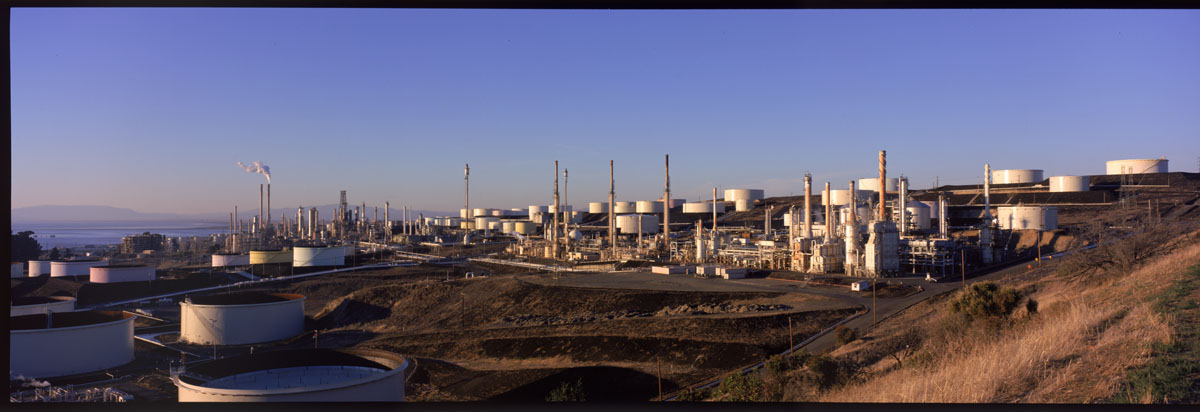
Here is an image from Vallejo, California taken with the Fuji 617 panoramic camera:
A good perspective on a ruin is some rubble in the foreground and the standing structure in the background:
For ruins in the American Southwest, the best images almost always show quite a bit of context (these are from New Mexico):
The average building is taller than the average photographer. This is the source of 99% of the distortion in the world's architectural photos. Distortion isn't always bad. Note the converging vertical lines in the following image, the Cathedral of San Giovanni in Laterno in Rome:
This is an extreme example and it comes from cozying up to the facade of the building, mounting a wide-angle lens (14mm) to the camera and tilting the camera body back so that the entire facade fits in the frame. This has the effect of projecting a flat surface (the front of the building) onto an angled surface (the film). Hence the distortion. Is it bad? The photo isn't very descriptive or accurate. It won't be bought by any guidebook publishers. However, it expresses the idea of the enormous cathedral looming over mankind better than a perspective-corrected image.
Suppose we have a humbler building, like this wood-framed house in Cambridge that contains a few condominiums:
The above left image was taken with a 24mm wide-angle lens held parallel to the ground. The vertical lines in the subject do not converge. All is well with the photograph except the composition. The bottom third of the frame contains the snow drift on the city sidewalk. We're trying to get a picture of the house. In the middle photo, we've tilted the camera back. The snow drift is out of the frame but notice that the vertical lines are converging. The house appears to be falling backward. In the right-most photo above, we've kept the camera level, with its film plane parallel to the building facade. To change the composition, we've shifted the lens up. This is only possible with a view camera or a special perspective correction lens on a 35mm camera. In this example, the lens was the Canon 24mm tilt-shift (TS) lens. Perspective correction lenses cast a larger image circle than necessary to cover the 24x36mm frame of a 35mm camera. However, it is possible to exceed the limits of the lens, in which case the corners of the frame will perceptibly darken:
The above left photo, of the same house in Cambridge as above, is taken with the camera level to the ground. The composition contains far too much of the street and the roof of the house is cut off. The center photo is shifted up enough to center the house. The right-most photo above shows that the Canon 24mm TS lens can be shifted beyond the limits of its image circle--note the dark corners at the top. Below is an example from Sweden:
A cheaper method that yields much higher image quality, is to use a view camera:
Click on the photo above to view a larger version and note the detail in the church. This photo was taken with Kodak Tri-X film (ISO 400) in 1981. The camera was on a tripod at about the same height as the very bottom of the church steps. Raising the lens eliminated the uninteresting green lawn in front of the church and included the steeple in the composition. See "Choosing a Large Format Camera" if you're interested in joining the view camera club. If you hope to do architectural photography commercially, the view camera is an essential tool. Clients will expect you to use one, though of course in the 21st Century they will expect to see a digital back instead of a film holder.
Whether you use a view camera or a tilt-shift lens on a rigid camera body, you'll need a tripod.
(See "Using Tilt-Shift Lenses" for more on the topic of achieving correct perspective with a Digital SLR system. You can also correct these kinds of distortions on a computer in post-processing.)
Buildings don't move. Ergo, only a lazy photographer would use a high ISO setting or a handheld camera to take a picture of a building. The professional approach is to start with the camera's lowest ISO (e.g., 100) for lowest noise. Generally a large depth of field is desirable in architectural photography. The viewer should have the choice to look at any part of the structure and find it in adequately sharp focus. Large depth of field implies a small aperture. A small aperture plus slow film implies a long shutter speed, too long for steady hand holding. Consequently, any serious architectural photographer will carry a tripod.
As noted in the perspective correction section, a professional architectural photographer will always have some means of controlling perspective, generally with a view camera.
For capturing the sweep of a courtyard or exaggerating the lines of a modern building, wide angle lenses are useful. With a full-frame digital SLR, a 16-35mm professional zoom is adequate 99% of the time. For showing a building and its environment in natural perspective, carry a 50mm lens. For compressing perspective and isolating inaccessible details, carry a telephoto lens of at least 200mm in length.
Sometimes buildings are just beautiful...