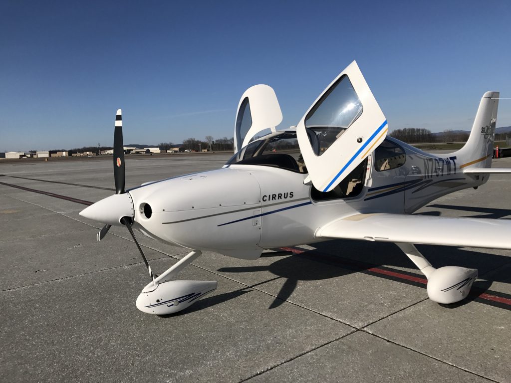
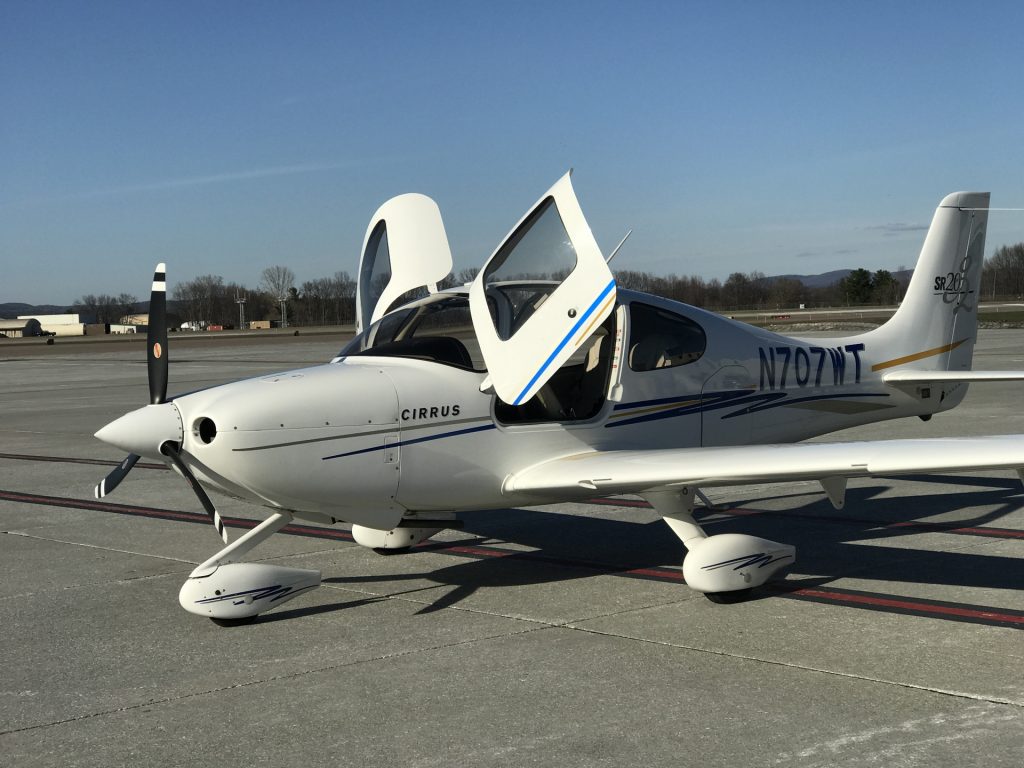
After an epic struggle with the U.S. government’s dreaded eAPIS system and two phone calls (the elaborate web-based system for advising the government of people leaving and entering the U.S. was layered on top of the old one, so you have to call the customs agents on the phone even after you’ve entered all of the information about an inbound flight into a web site), we managed to connect with the U.S. Customs agent at the Burlington, Vermont airport. The light was hitting our tired 12-year-old flight school Cirrus SR20 just right so it was time for a photo. Here is the same scene with the basic camera and with the fancy “telephoto” lens that is the big innovation of the iPhone 7 Plus:
13 thoughts on “iPhone 7 Plus camera has no clothes”
Comments are closed.


It’s funny that this post shows up in my regular browser but in my incognito browser it doens’t show up, even after refreshing both a couple times (same URL for both). Weird.
That “telephoto” is underwhelming, for sure.
That said, I’ve absolutely love the cameras on my iPhone 5, and 6s Plus. It’s always with me, and the quality is superb. Video is also very, very good. Love the “landscape” feature, as well. Easy to hand to strangers to take a picture.
I rarely use my DSLR any more, unless I need a flash or a longer lens.
It’s completely obvious that the telephoto shot has so much more of that indescribable insanely great mojo that makes Apple products superbly outstanding and anything done with them almost as incredibly awesome. The colors, highlights, and shadows just plain pop more in the telephoto in addition to the Apple signature sizzling sharpness that we have come to expect from the most revolutionary electronic products the world has ever seen.
Specs say 28mm/56mm equivalent focal lengths. Wouldn’t the lens/sensor distance for a more significant telephoto have to be a lot longer even for its tiny sensor? Wouldn’t that lead to a fatter camera hump ruining the sleekness people have come to expect? We can’t have that can we?
Don’t forget to file an ICAO flight plan and put border crossing time in the remarks. You used to be able to file a DVFR plan but not sure what happened with that. If you love the US EAPIS system you are really going to love the mexican one.
The details on the horizon appear to be magnified for the photo on the right. Notice the white structure which is to the left of the propeller in left shot and the same white structure to right of the propeller in the right shot. Also the two photos appear to be shot from significantly different angles. The alignment of the airplane with respect to the horizon and the two parallel dark streaks extending to the left in both shots is quite different. It does not appear that the two shots were taken with the phone clamped into position, which makes it difficult to evaluate.
To be honest, I can really tell the difference between the two pictures.
Philg – have you seen this? Pilots can earn $300,000 in China: https://www.bloomberg.com/news/articles/2016-08-17/chinese-airlines-lure-expat-pilots-with-lucrative-pay-perks
German: I assume you meant to write “I can’t tell the difference.” You don’t see that the right-hand photo (with the “telephoto” lens) is green? The plane is white in the left photo (and in real life). Also look at the rich blue of the sky in the photo with the standard (wide) lens.
There’s a big white object in the center of the picture, and bright daylight should be just about the easiest light to white balance for. Indeed, it takes about two seconds to get the colors in both images to match in any drawing programme.
Since it’s unlikely Apple’s software is actually unable to white-balance the image, it’s likely to be an intentional choice. Slightly more yellow tones, and, if I’m not mistaken, slightly lower contrast, that’s a good idea for portraits, right?
Which in turn makes you wonder why Apple’s software isn’t able to detect that the image taken by the 40 degree angle lens contains neither skin tones nor faces, and that it should switch to its neutral ‘object’ color profile used on the 75 degree angle lens.
@philg, that’s so-called “Nikon green”, this happens when the phone firmware decides to optimize the color curve for the “landscape”. The web is full of similar comparisons, usually with blueish Canon on one side and greenish Nikon on the other.
BTW about 50% of people would say that the photo on the right is perfect, while the one on the left has a magenta cast. Then there’s a loved/hated thing called “sony reds”. Color rendition is a subjective thing, that’s why some cameras now have switchable color profiles, my favorite implementation is Fuji’s “color modes” named after their old films: Velvia, for example.
Ev: You don’t think the wide photo has a lot more contrast and pop? It is more faithful to the scene as I remember it. The light was truly spectacular, even if the plane could use some upgrades.
Phil: yes, I can’t tell the difference. But now that you mention green being the difference, to my embarassment, I have to admit I am red-green color blind! That doesn’t mean I can’t see the difference between absolute green or red (if you give me the colors side by side, I can tell them apart). I just have trouble identifying tinges of either color or mixed in with other colors. So another reminder for me to stay away from commenting on photography. My apologies.
This review’s main complaint about the “tele” lens is its poor low light performance:
https://www.dpreview.com/reviews/iphone-7-plus-camera/