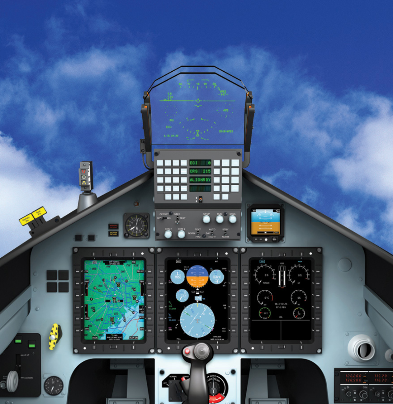
At Oshkosh this year I attended a talk by an Air Force flight instructor about how military pilots are trained. He showed slides of various USAF trainers and the panel layouts are completely different from the latest and greatest civilian panels. Here’s the avionics suite that goes into a T6C “Texan II” trainer (i.e., a Swiss-designed Pilatus):
The heads-up display is where the engineers expect the pilot to look. The switches just below the HUD are next in visual accessibility. The big TV screens that get pride of place in a modern civilian aircraft are relegated to a low “last resort” position.
As impressive as the latest Garmin G3000-equipped jets are, could it be that the whole design philosophy is wrong?
Related:
- MyGoFlight retrofit heads-up-display (uses a BMW-style projector), which I tried at Oshkosh and it seems to work well. About $25,000 as a retrofit? (as with most things in aviation, the option for the plane (e.g., A/C) costs about the same as an entire automobile that contains the same feature!)

Used to think all airplanes had caught up with the 20th century & had HUD’s, 20 years ago. The internet changed that. None of the vlog pilots have a HUD. It’s still some kind of novelty.
Touchscreens are on the way out
https://techcrunch.com/2019/08/11/navy-ditches-touchscreens-for-knobs-and-dials-after-fatal-crash/
The Swiss design is very clean and uncluttered. I’m not a pilot but I’d like to learn flying in a plane with avionics like that. The only thing I would change are the corners of the displays. I don’t see the reason to have 12 contrasting dots for the fasteners at the corners of those rectangles, but there might be someone who thought they were useful to guide the eye. I think they’re superfluous.
I don’t think the Garmin philosophy is “wrong” but you can have too much of a good thing.